All work
01/Health-tech

PowerUp

A workplace wellness platform rebuilt on the web, extended to iOS and Android, and taught to read a blood pressure monitor through the phone camera.

Domain
Health-tech · corporate wellness (B2B)
Status
Live — app.powerupglobal.io, App Store and Google Play
01

The challenge

PowerUp sells to employers, not consumers. An organisation buys it so its people can profile their own health across a nine-dimension wellness model — seventy-plus underlying metrics — and so the organisation can see what absence, presenteeism and workplace accidents are actually costing it.

That business model puts unusual weight on data quality. The product only works if a large population of employees keeps feeding it accurate information, over months, without anyone chasing them. Two things stood in the way.

The first was the existing web front end. It carried a long, demanding assessment, and the employer buying the product didn't like it enough to put it in front of staff. For a platform sold on organisation-wide rollout, that isn't cosmetic — a front end people bounce off is a product that never accumulates the data it needs.

The second was that PowerUp had no mobile presence at all. Health data doesn't live on a laptop. It lives on the phone, in Apple Health and Android Health Connect, and on the wearables that write into them. And it lives, stubbornly, on a category of device with no API of any kind: the blood pressure monitor on the kitchen counter, the glucose meter in the drawer. Those readings are the ones the platform most wants and the ones nobody reliably types in. Reading four digits off an LCD and retyping them is a small friction repeated daily — which means it stops happening within a week.

02

Our role

OlvixAI owned the entire client-facing surface of the product and the machine learning behind the capture feature. Two engineers split four areas: a full redesign of the web platform including flows that didn't previously exist; the mobile app designed and built from scratch for both platforms; the vision model that reads home health devices, plus the correction and retraining loop behind it; and DevOps — environment management for the web platform and the release pipelines for both app stores.

The boundary is worth stating plainly. The platform API and the FastAPI service serving the vision model were built and maintained by the client's in-house developer. Where the redesign or the app needed a backend change, we specified it and it was implemented on their side. We integrated against that backend rather than owning it.

03

What we built

The web platform — the client's psychometric instrument left intact, everything around it rebuilt.

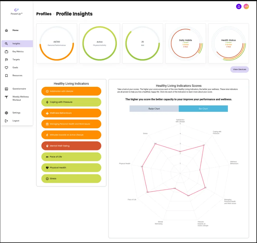
  • Profile Insights — the landing view for a completed profile: performance score, physical activity status, BMI, and rolled-up rings showing how many dimensions are green, amber and red.
  • Healthy Living Indicators — all nine dimensions, readable two ways: a radar chart for shape and a bar chart for comparison, each clickable through to what it measures and why the score is what it is.
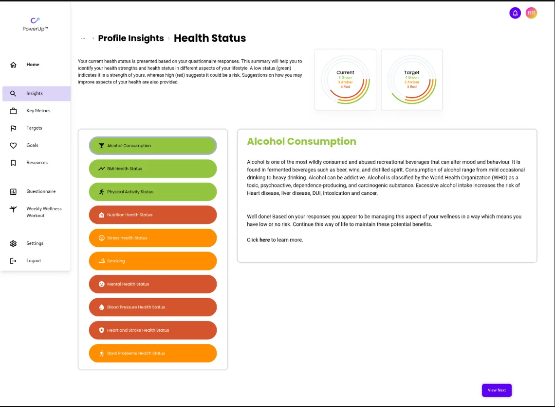
  • Health Status detail — per-topic breakdowns across alcohol, BMI, activity, nutrition, stress, smoking, mental health, blood pressure, heart and stroke risk, and back problems. Plain-language context, current standing, target beside it.
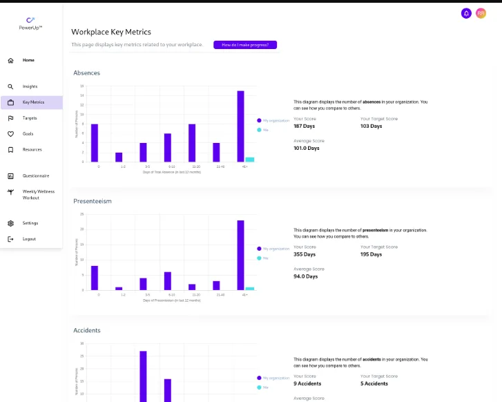
  • Workplace Key Metrics — the employer-facing half of the value proposition rendered for the individual: absence, presenteeism and accident figures plotted against the organisation's distribution, its average, and the user's target.
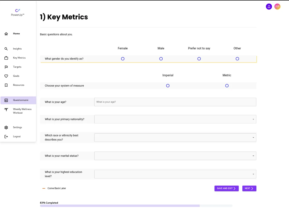
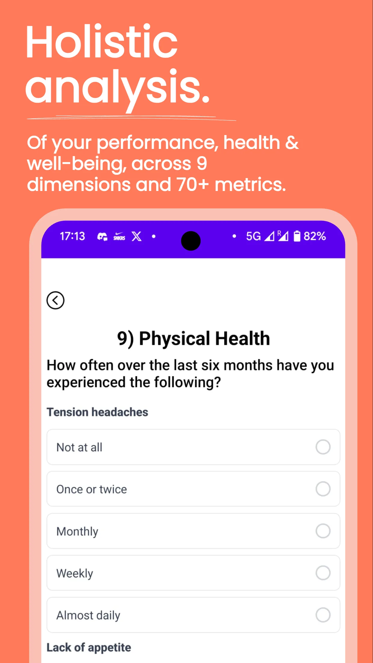
  • The assessment — rebuilt around the reality that nobody finishes it in one sitting. Visible progress, section numbering, save-and-exit, and a resume path that returns you exactly where you stopped.

The mobile app — React Native and Expo, both stores from one codebase. Not a wrapper around the web product; it exists to do what a phone can and a browser can't.

  • Native health sync — steps, distance, active and resting calories read from Apple HealthKit and Android Health Connect, so anything the phone or wearable already records flows in without being re-entered.
  • Camera capture — see below.
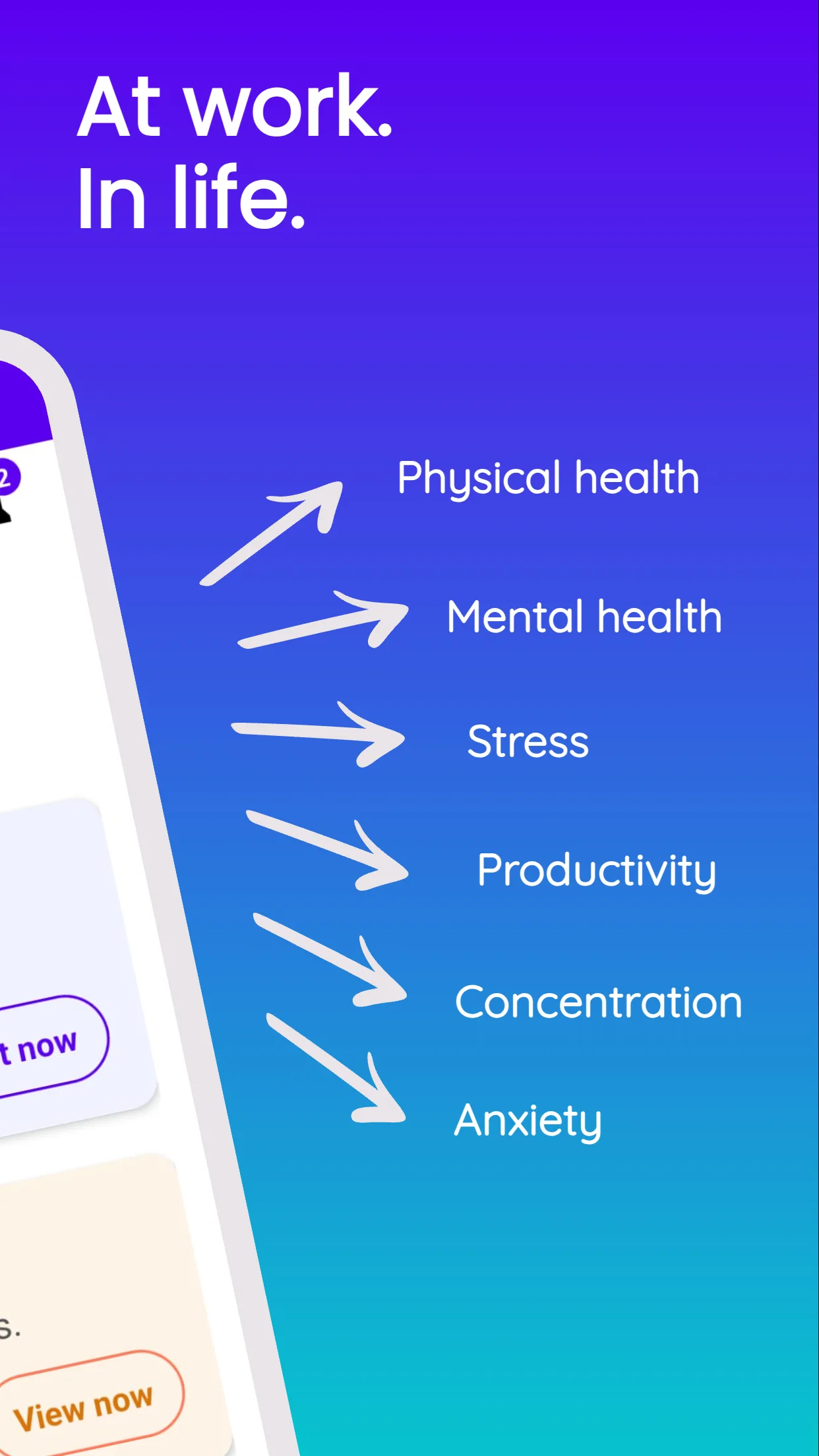
  • The profile on mobile — the same nine-dimension assessment laid out for a phone, so seventy-plus insights can be worked through in short sittings.
  • Points and notifications — a light gamification layer aimed squarely at the retention problem that makes or breaks a wellness rollout.

AI capture from home health devices — the part that attacks the data-quality problem directly.

The user points the camera at a device with no connectivity of any kind — a blood pressure monitor, a glucose meter, a heart rate readout — and takes a photo. A server-side vision model we trained for this specific task extracts the values and returns them into the form, already filled in. For a blood pressure monitor that's systolic, diastolic and pulse, parsed out of one photograph of a seven-segment LCD.

Three reading types are supported. In every case the entry the user was going to make by hand still gets made — the model just makes it first.

04

Stack

Technology stack, by layer
LayerWhat we used
AI / ML
  • A vision model trained in-house for reading home health-device displays
  • server-side inference
  • a correction-driven retraining loop, retrained bimonthly on user-corrected readings
Frontend (web)
  • Next.js
  • React
  • Tailwind CSS
Mobile
  • React Native
  • Expo
  • Apple HealthKit and Android Health Connect
  • camera capture
  • in-app notifications
  • one codebase, both stores
Backend
  • FastAPI inference service on Azure, plus the core platform API — both owned by the client's developer
Infrastructure
  • Azure for inference
  • web deployment and environment management
  • App Store and Google Play release pipelines — owned by OlvixAI
05

Decisions

Decision01

The camera is an assist, never an authority

A model reading a blood pressure monitor is reading a clinical number. Silently writing a misread value into someone's health record is a far worse failure than not reading it at all, because the user has no way of knowing it happened — and in a product an employer has asked its staff to trust, one bad number that surfaces later costs more credibility than the feature ever earned.

So extraction commits nothing. It pre-fills the form. The user sees the photo they just took with the parsed values in editable fields beneath it, and nothing saves until they confirm. Practically, that turns data entry into a glance-and-tap, which is the actual win. The model isn't there to be autonomous. It's there to remove keystrokes.
Decision02

Every correction is a training example

That confirmation step is also the most valuable thing in the system, and treating it as merely a safety net would waste it. When a user edits a value the model got wrong, the edit is a labelled example: a real photograph, taken by a real user, on real hardware, in real lighting, paired with ground truth. No synthetic dataset gives you that distribution.

So corrections are captured and the model retrains on them bimonthly. It improves specifically where its users struggle — the device models, screen types and lighting found in the field, not the ones that happened to be in the original training set. The safety mechanism and the improvement mechanism are the same mechanism.

Decision03

A purpose-trained model rather than a general OCR service

The cheap route is a general-purpose OCR or vision API. We trained a model instead, because this is a narrow, closed visual domain — segmented LCD digits in fixed positions on a small set of consumer device layouts, photographed at arm's length. Narrow domains are where a purpose-trained model beats a general one on both accuracy and cost per call. It also means the model belongs to the client and improves on the client's own data, rather than the feature's quality being pinned to whatever a third party ships next.

Decision04

Syncing health data on open, not in the background

Background health sync is expensive in the two currencies that matter for a wellness app: battery, and the permissions you have to ask for. Both platforms treat persistent background access to health data as a serious grant — and an employee being asked by their employer's app for always-on access to their health records is a conversation the product doesn't need to have.

Sync-on-open gives the user current data every time they actually look, at no battery cost, behind a permission prompt that's much easier to say yes to. The tradeoff — data fresh as of last open rather than continuously — is invisible in a product whose interaction model is already daily check-in rather than live monitoring.

06

Results

No formal product metrics were tracked on this engagement, so there are no adoption, retention or model-accuracy figures to report. What is real and checkable is what shipped.

0
App stores shipped to
0
Reading types automated
Results
Product surfacesTwo — a fully redesigned B2B web platform, and a native mobile app for iOS and Android built from scratch
Mobile releasePublished and live on the App Store and Google Play, from one React Native / Expo codebase
Reading types automatedThree — blood pressure, blood glucose, heart rate
07

Screenshots

PowerUp Profile Insights dashboard showing personal performance score and health rings
Profile Insights
Health Status screen listing nine wellness dimensions colour-coded green to red
Health Status detail
Healthy Living Indicators scored across nine dimensions
Healthy Living Indicators
Workplace Key Metrics comparing the user against their organisation
Workplace Key Metrics
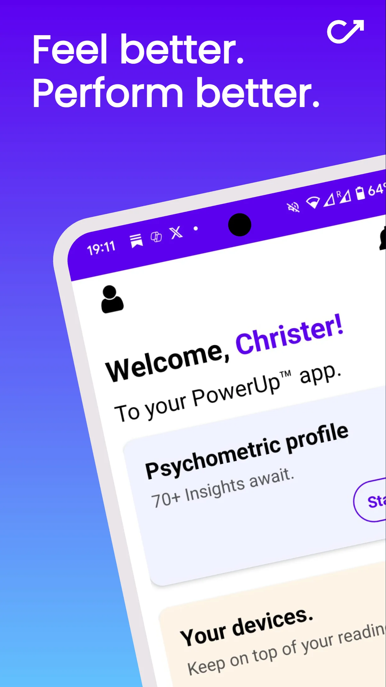
PowerUp mobile app home screen
Mobile — home
PowerUp mobile app health tracking screen
Mobile — tracking
PowerUp mobile app assessment screen
Mobile — assessment